Brand typeface debuts in global campaign
Over the past 77 years, Portland-based Columbia Sportswear Company has earned a large and loyal following through its focus on quality and innovation. This year, Columbia launched its biggest global advertising campaign in the company’s history headed up by branding agency NORTH.
While developing Columbia’s new campaign, NORTH reached out to Pete to create a custom typeface for the campaign. The project grew when Columbia decided to adopt the custom typeface for the brand, and expanded the scope to include multiple weights, web-optimized versions, and language support for global markets.
"Pete is the only designer I trusted with this project,” said Mark Ray, Chief Creative Officer at NORTH. "He always brings a sharp and talented eye, a great work ethic, and a transparent, collaborative spirit."
A typeface rooted in history
Columbia’s rich history in Oregon provided a jumping off point for the typeface inspiration. “As part of my research, we looked back through Columbia’s past, its advertising, and how the brand presented itself to consumers," said Pete. He eventually came across an old 1950’s ad from Columbia’s hat-selling era— a large, iconic ‘C’ taking up most of the page. “I knew that was a special, unique notion for their brand. The entire typeface really stems from the geometry of that ‘C’."
"This project was a big assignment for us, establishing an iconic, soulful graphic direction of a multi-million dollar, long-term campaign, said Ray. "Pete's the real deal; we're lucky to have him next door in Portland."
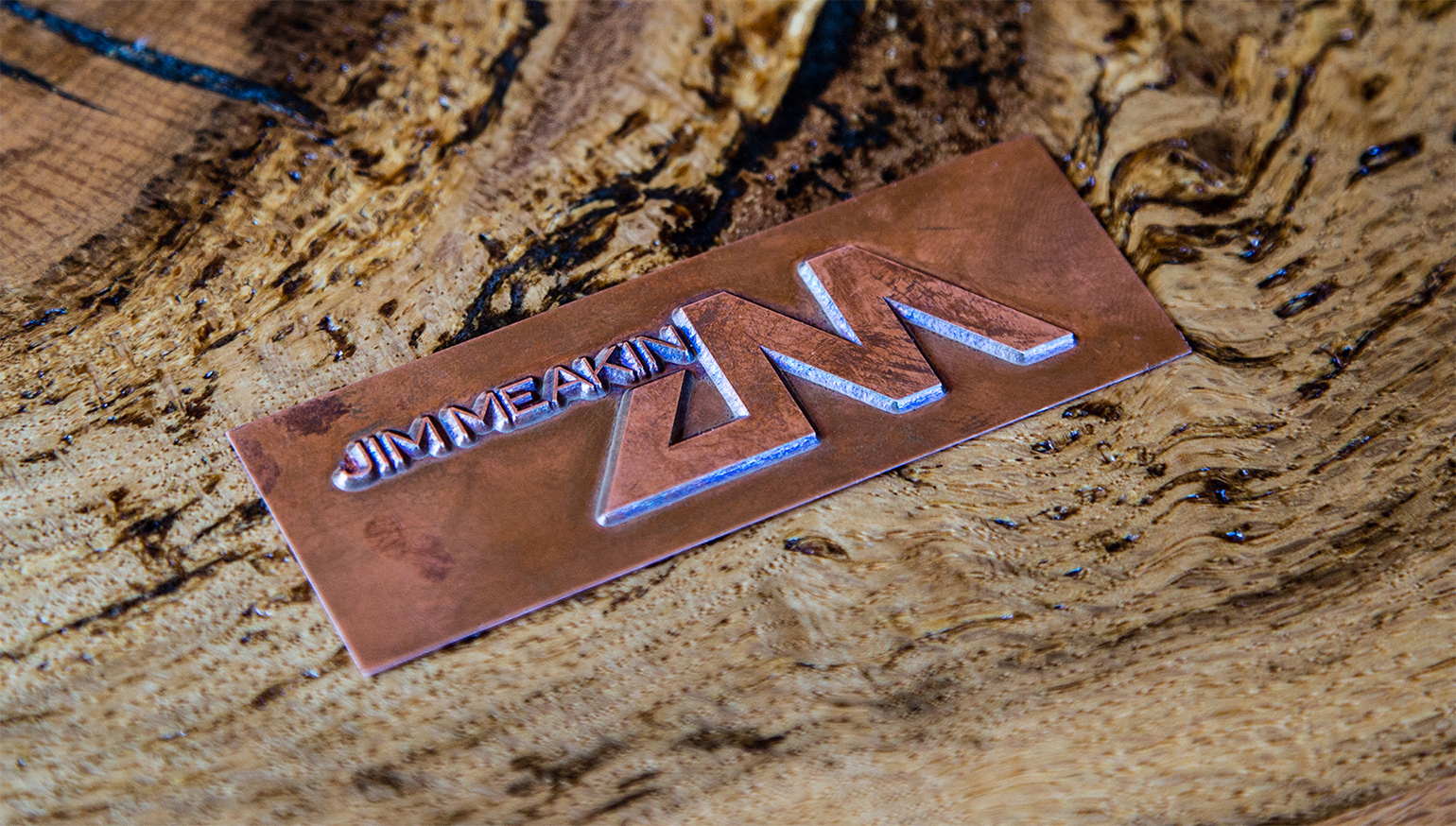
Columbia brand type created by Pete McCracken in collaboration with NORTH and Columbia creative teams.


Web-optimized and extended language support
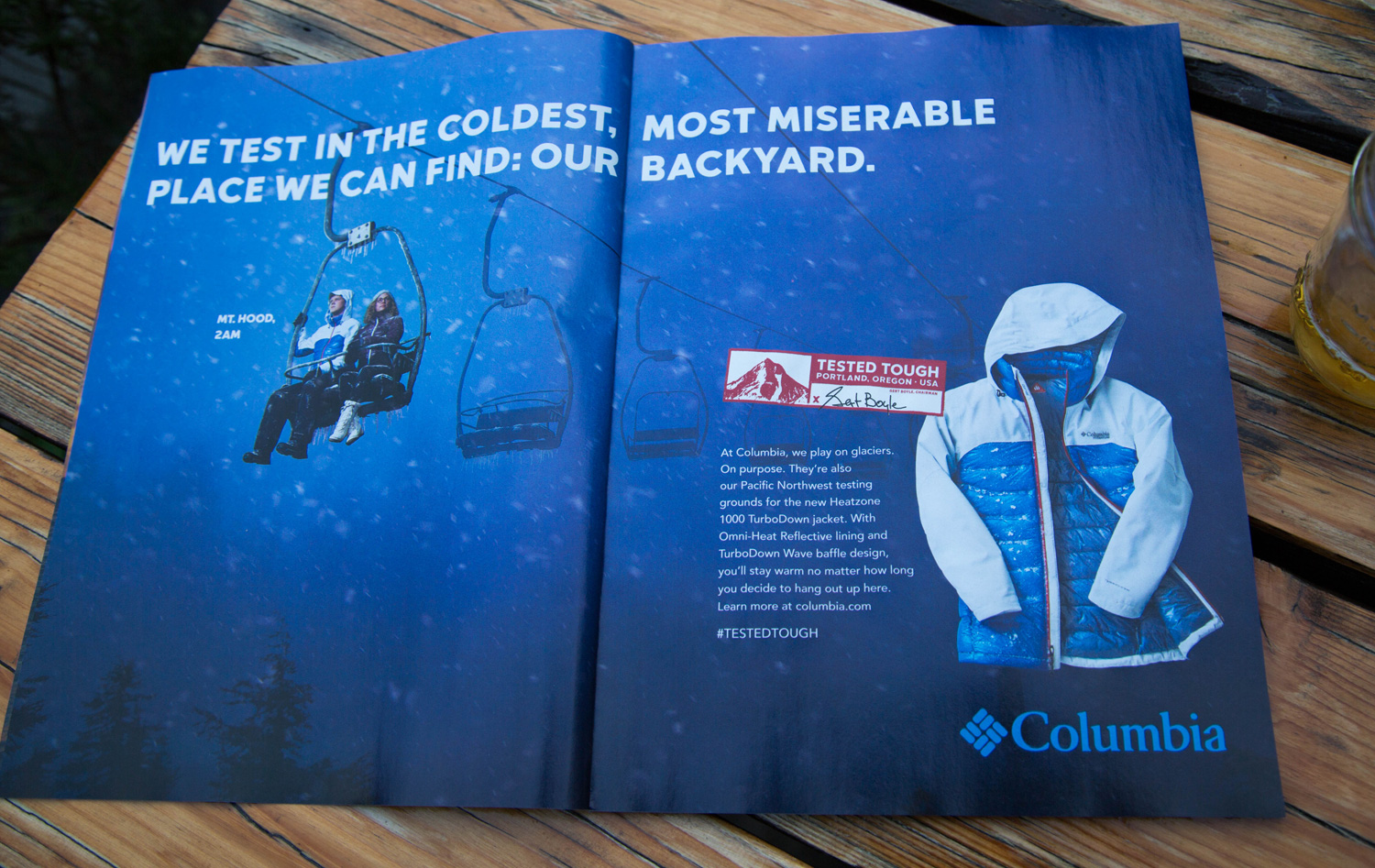
The resulting typeface family, aptly named GerTT after chairman Gert Boyle, fuses modernity and heritage, and pays tribute to Columbia’s origins. It includes four different weights, each with its own web-optimized version for seamless function online, and superscript numbers for retail use. Pete also designed GerTT language support for Latin, Polish, Czech, and Cyrillic—both Russian and Ukrainian—languages.
The campaign premiered in New York early October, and will be rolled out in 63 markets across Europe, Asia, South America and North America. In addition to broadcast, the GerTT typeface will appear prominently in print, out-of-home, online, and in social media


Anderson 1938 Propels REI Forward
Last year, REI sought to completely re-energize its brand. The Seattle-based retailer had started feeling pressure from the saturated market, and needed to reestablish itself as the expert on gear and apparel for outdoor adventures. Pete was tasked with creating a new master brand typeface that would revitalize REI’s look, while also paying tribute to the brand’s heritage as an outdoor authority.
REI’s Creative Director for Brand, Jason Sutherland, suggested the font should feel like “a picnic table in a campground with rounded, worn edges and the well-traveled road trip lovin’ Volkswagen bus.”
This idea immediately clicked with Pete, who had a VW bus of his own, and had driven it on several cross-country adventures. While exploring letterform ideas, Pete drew inspiration from the gradual and rounded curves of the late 1970’s VW model, and its speedometer for numerical ideation. Pete also looked to iconic router-carved trail signs for inspiration.

REI's Anderson 1938
The resulting Anderson 1938 font family in three weights (regular, bold and heavy) has been implemented across every REI brand touchpoint, including in-store, apparel, online and even on the back of receipts. The design nuances create a friendly, approachable and authoritative feel.
“Pete really kept us from going too boring, and pushed for some of the quirks we’re really proud of in the typeface,” said Sutherland. “He has a great understanding of how to convey personality, but also made it incredibly functional across all the demands for a typeface. There’s a warm hug in what we do, and now our typeface reflects that.”
REI has continued to collaborate with Pete on developing additional weights for Anderson 1938, as well as creating brand posters for the REI Village, and designing collectable stickers available in stores across the country.


2015 Online Fall Campaign
Updated web design and fall campaign - headline, subhead and navigation

2014 Holiday In-store campaign